
Updated: October 19, 2026
Lower thirds and on-screen graphics for conference speakers
Watch any polished conference video and you will notice a small but powerful detail: as each speaker begins, their name and title slide neatly onto the lower part of the screen. These are lower thirds, and along with other on-screen graphics they turn a plain recording into a professional, branded piece of content. For corporate and conference video, getting them right is one of the easiest ways to lift the whole production.
Lower thirds seem simple, and that is the point. Done well they are almost invisible, quietly telling the viewer who is speaking without ever getting in the way. Done badly they distract, misspell a name, or clash with the brand.
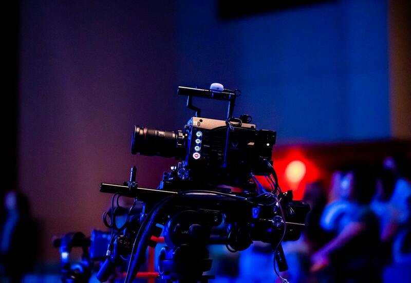
What good on-screen graphics do
Beyond looking professional, graphics do real work for the viewer. A well-planned set of graphics can:
- Identify each speaker by name and title, so viewers always know who is talking.
- Reinforce the event and sponsor branding consistently throughout.
- Introduce session titles and topics as the program moves along.
- Add calls to action or key details at the right moments.
This is closely tied to how you capture the speaker in the first place, so plan graphics alongside the shoot, as our guide to keynote speaker video recording describes. Sponsor visibility in particular often runs through graphics, which connects to our guide on sponsor recognition video.
Getting the details right
The most common failures with lower thirds are avoidable, and almost all of them come down to preparation. Names and titles must be spelled and formatted correctly, which means collecting them accurately before the event, not scrambling during the edit. The design should match the event's brand, sit clearly against the background, and stay on screen just long enough to read without lingering. A few practical habits prevent most problems:
- Gather a clean, confirmed list of speaker names and titles in advance.
- Design graphics to fit the event branding, not a generic template.
- Keep text short and legible, with strong contrast against the footage.
- Time each graphic to appear as the speaker starts and exit before it overstays.
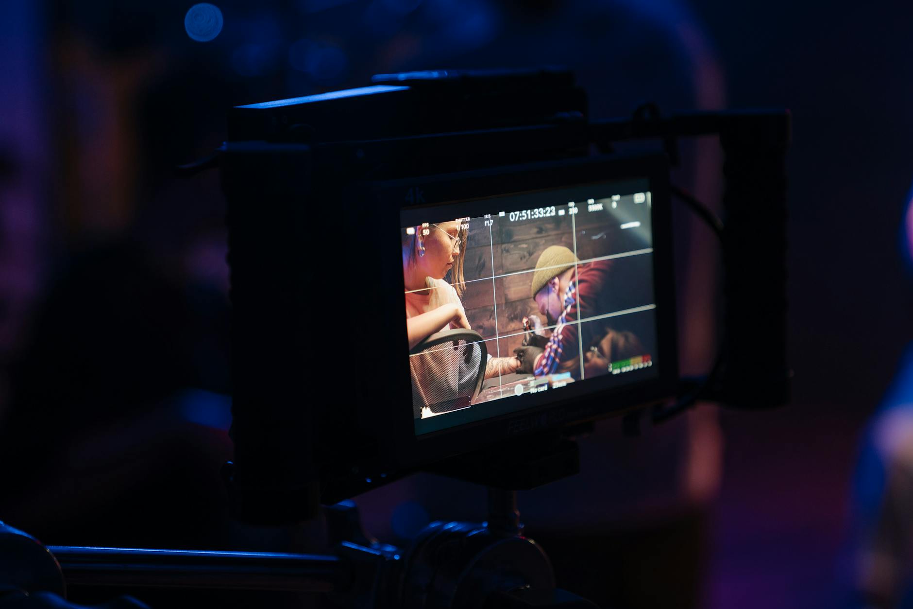
Planning graphics before the edit
The biggest mistake is treating graphics as an afterthought in post. The best results come from planning them as part of the whole production, deciding early what information appears, in what style, and when. That preparation makes the edit faster and the result more consistent, which is especially valuable when you are also producing a fast turnaround piece like a corporate event recap video. When the name list and brand assets are ready before the event, the graphics almost build themselves.
Small graphics, big polish
Lower thirds and on-screen graphics are a small investment that makes conference video look genuinely professional and keeps viewers oriented. Collect accurate names early, design to the event brand, keep everything legible, and plan the graphics before you reach the edit. Get these details right and your event video looks like it belongs on a main stage. If you want help planning graphics for your next event, explore our production blog or reach us through the contact page.